DON POROLON
a bespoke designer furniture studio
Before starting the design process, a moodboard and color palette were created. This helped define the overall atmosphere of the project, set a clear visual direction, and establish a foundation for working with materials and content presentation.

Homepage
The homepage is based on a clean, visually calm composition and large-scale typography.
A side (burger) menu is placed on the left, utilizing space that often remains unused. This approach preserves the minimalism of the interface and allows quick access to the catalog without overloading the main screen.


This section of the homepage functions as a visual catalog with horizontal scrolling. Smooth animation plays a key role in user interaction here.


New Arrivals & Bestsellers
The New Arrivals & Bestsellers section is designed as the opposite of typical promotional blocks filled with aggressive buttons and visual noise.
There is no pressure on the user — the open space and quiet interface create a sense of air, allowing visitors to explore the collection at a comfortable pace.

Сatalog
The catalog does not follow a standard grid layout, where products compete for attention all at once. Instead, it is designed as a sequential visual journey: the user smoothly moves from one category to another, focusing on each section individually.
This approach guides attention, sets a viewing rhythm, and makes navigation calm and intuitive.

Blog
The blog features an interactive timeline that responds to scrolling and displays the date associated with the current part of the article. This animation creates a sense of movement through time and keeps the user engaged, inviting them to pause and interact with the content.
Because modern users are less inclined to read long texts, the article layout is designed as a visually comfortable space. Typography, layout, and animation work together to reduce visual fatigue and make reading enjoyable.


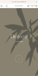
Info
Informational pages are often monotonous and quickly become tiring. Here, each informational section is designed differently — with its own color and mood.
This approach makes the text easier to perceive, helps retain attention, and improves memorability.


About
Color and typography become the main design tools in this project. I use them when it is important to focus attention on meaning rather than imagery.

I truly enjoyed working on this project from an aesthetic perspective. It is especially inspiring and uniquely meaningful to me that people from creative professions turn to me for design work. One such project can be seen next — a floristry studio.